Wednesday, 27 March 2013

DPP-Assignment Three; Learning Log


Learning log – DPP assignment 3; Monochrome

“…….everything looks worse in black and white”

(Paul Simon – From the song: Kodachrome)

 When I read this I laughed!, so I had to include it in my log. That’s not the only reason I included it, because in a way, he is right!. On looking back when I first thought about this assignment, what popped in to my head was ‘Dark, morose, melancholy’ and from what I noted in my assignment, with regards to the exhausted image that I found in my book, would have looked a lot happier, in colour, so in a roundabout way, it makes sense, we sometimes use black and white to portray feelings that are “worse” than what it would be, than with a colour image. I know that’s not what he means by this, as it is from a song, however, I like to look at in a different light!. By the by, the other thoughts I had after the first three above were, ‘dramatic, powerful, detail and contrast’. On that note, I have a happier quote, which I believe and love.

 
“Black and white photography does more to invoke an emotion and freeze a moment in time than any other medium. Looking back over the decades at such famous photographers as, Steigletz, Weston, Adams and others has helped elevate black and white photography, to a fine art form. The subtle tones of gray’s, the strong emphasis of the blacks and the softness of the whites makes one look much closer at the subject and composition due to the lack of natural colour. Emotions are always much easier to portray with black and white, because of the stark contrasts and the sharp focus on the subject”

(Bob Snell)


 With the above quote in mind I refer to an image taken by, yep you guessed it, Ansel Adams, I just love the contrast in his image, the way the sand looks like waves in the sea, the tight composition and the detail is amazing.
 
 
My Thoughts
I really, really enjoyed this assignment, I never thought I would and that I would love shooting in black and white, it’s something I rarely do, I think mainly due to all of the software programs that are out there. Which is a shame, however, that can now be remedied!, it was really helpful to look at the screen as to how the image was in black and white, as I feel it really helped my in this assignment.
As I said in my assignment, it was quite windy so extremely difficult to get the sharp detailed images I wanted to achieve, so I feel that I should have had a better tripod. Once I have some funds, this will be on the top of my list to get!.
 
Strengths on my assignment
I think with this assignment, my strength is in the contrast with each image, I really like how I portrayed the strength of the black and the white, I think using bracketed exposure on my camera really helped and as always, I am happy with my composition. I am really happy with all of my images, but I may have to rethink a few of them, depending on my feedback.
 
Weaknesses on my assignment
It’s the sharpness and strong focus which I have not ascertained with this assignment, I wish I could go back again and do it on a day which wasn’t windy, or, with a different tripod, however, I think I’ve been enough times this year!. I also wish I could have got the shot of the bridge with the people on a bit better, so that the three lights were in it, with a lot of the ground in front as well. I also think that sometimes it’s a good to have an image which is no entirely sharp, which does actually work well for that particular image.
Some of my research sources-Books, websites and documents
·         Ansel Adams at 100 by John Szarkowski
·         Black + White Photography: all about modern monochrome by Elizabeth (ed) Roberts
·         The Art of Black and White Photography: Techniques for Creating for Creating Superb Images in a Digital Workflow by Torsten Andreas Hoffmann
·         Edward Weston (Photo Book Series) Terence Pitts

DPP-Assignment Three


Assignment Three; Monochrome

Object of assignment three
This assignment is about the different creative effects of a monochrome image, I should have already had the opportunity to discover what makes a good subject and picture conditions to create a good black and white image. I have to choose my own subject that I conceive, shoot and process solely in black and white, attempting to bring out the monochrome images of form, tonal contrast and texture. I need to produce between 5-10 images and write an account of why I chose my theme/subject.

For this assignment, I chose to do a cityscape, rather than a landscape, which was my original thought; however I have not really done one before, so I wanted a bit of a challenge. I chose Dublin at dusk, I chose this theme as the ha’penny bridge was beautifully lit up at night, the sky was amazing when I was there and Dublin has some detailed structures, which I believe makers for great black and white photography. I shot at dusk as I wanted to capture the darkness of black and white with shadows from the artificial light, I do have a daytime shot in my set of images as the sun was low and reflecting off of the subject extremely well.

I used my 18-200mm lens for this assignment and my tripod due to the low light, when taking the images I used the exposure bracketing function on my camera as I wanted to see how the black and white image looked on my LCD screen to see which exposure enhanced the beautiful menacing look I wanted to achieve.

Monochrome
My Friend recently bought me a book called “Through the lens, National Geographic greatest photographs” it’s an amazing book and with this assignment in mind, I mainly concentrated on the black and white images. Although some of the images were taken at a time when colour was not available, or limited, I found a few images that were purposefully taken in black and white, in studying them closely I realised they are better in monochrome and would not suite colour. I think this is due to the contrasting shadows in the images and the feeling of monochrome, by this I mean, it suites a more dramatic and melancholy mood, for example, one of the images taken was at a campsite in Minkouala, Gabon. It had various people standing and sitting around, from different ethnicities, with smoke rising from the fire in the middle of the jungle and not a single smile in sight, they looked like they had a long day from their research expedition. Now that particular image would not have worked in colour, as you can feel they are exhausted and the monochrome enhances that feeling. (There was no reference of who the photographer was)  

“A great photograph is one that fully expresses what one feels, in the deepest sense, about what is being photographed”

(Ansel Adams)

 I chose a quote from Ansel Adams as, I’m sure anyone who reads my assignments, is aware he is my hero but also he relates strongly to monochrome imagery. I can honestly say that looking at his black and white images take me away and also influenced me in my decision making to go to the USA. With that in mind, I think his monochrome images are a powerful tool. 

Books used for this assignment;
·         Ansel Adams at 100 by John Szarkowski
·         Black + White Photography: all about modern monochrome by Elizabeth (ed) Roberts
·         The Art of Black and White Photography: Techniques for Creating for Creating Superb Images in a Digital Workflow by Torsten Andreas Hoffmann
·         Edward Weston (Photo Book Series) Terence Pitts

Websites used for this assignment;
http://www.photographyicon.com/anseladams/
http://en.wikipedia.org/wiki/Edward_Weston
http://www.techterms.com/definition/monochrome
 
So on to my monochrome images, I have put the earlier evening one in first to create a sequence, so they are in order.

1; 1/4000 seconds at f/5.6
This image really stands out for me, I really like it, I feel like the lamppost is sparkling and the detail in it is mesmerising. I did not use a tripod for this photograph as the light was bright enough, for what I wanted to achieve.


2; 1/40 seconds at f/3.5
I saw this lamppost on my way to the ha’penny bridge, I thought it was really interesting, especially with the picture that someone had attached to the light. I tried to get as low as I could without losing the top of the lamppost, I also tried to take the image without the car in, but it was a busy road and it was difficult to do. I would have liked to have gained more detail in the bottom of the image with still obtaining the darkness surrounding it.


3; 1/80 seconds at f/3.5
I wanted to really get the detail of the tree with the light background of the sky. I feel this is an effective image, especially with the river in the frame as well, it makes me feel peaceful.


4; 1/15 seconds at f/3.5
This is the ha’penny bridge, I tried a few different compositions for this, I tried to have only the reflections on the water, which was ok but I feel this image works better, with a lot of the sky being one of the main focuses in the photograph. I used my tripod for this image, although I would have liked it to have been a bit sharper, it was quite windy and my tripod is not as sturdy as I would like it to be.


5; 1/20 seconds at f/3.5
I had a tough choice with this image. I have a few similar ones which focuses more on the ground if front, than the sky. I ended up choosing this photograph due to being able to see the row of the 3 lights, which made the image brighter at the top but you can still see the long shadows from the passersby. I like the long dark shadows in this photograph, it makes the image seem cold and morose.


6; 1/40 seconds at f/3.5
This is a close up image of the bridge itself with all of the ‘padlocks of love’, the bridge is famous for it. Similarly with my previous image, I had to choose between a close up image and this one. I chose this photograph in the end as I like the slightly ostentatious detail of the metal and the sky in the background.

DPP-Part 3; Exercise 8


Exercise; Colours in to tones 2

The objective of this exercise is to practically use the channel sliders in Photoshop raw in the black and white section, to generate an image in one of the following subjects;-

·         A landscape in which you emphasis the depth by strengthening the visual effect of haze
·         A portrait in which you lighten the complexion without significantly altering the tones of the rest of the image
·         A picture of a garden in which the green vegetation appears light in tone

The subject I chose (which isn’t a surprise!) was the landscape subject, I then have to show a black and white default image that the software choose for me and then I have to generate my own image, with the channel sliders to create a haze.

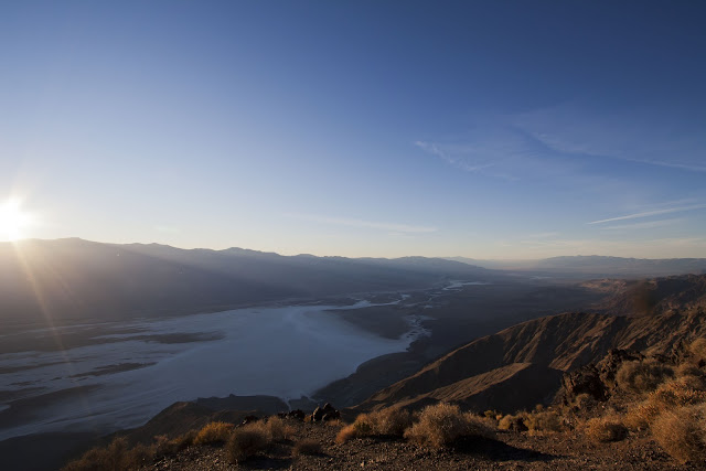
I choose an image which had a slight bit of haze in it, to see if I could accentuate it, here is the original image.


This is the default image that Photoshop produced;-
In my opinion, it doesn’t really “Pop” for me, the dark is quite dark in the wrong areas and the sun is too bright, the haze is still there but it’s not exaggerated enough for me.


This is the image that I adjusted;-
To create more hazing the image, I wanted to accentuate the sun and darken the sky, so to be able to see more of the rays of the sun.  To accomplish this I did the following;-


Channel sliders darkened
Yellow
Blue

Channels sliders lightened
Reds
Orange
Aqua
Purple
Magenta

I darkened the yellows to quash the intensity of the yellow light slightly and also slightly darken the foreground and I lightened all of the other channels to enhance the haze, without it being too false or overbearing.
 
I think the Photoshop software dose a good job, but if you want to get an image to your specifications, the channel sliders are extremely useful , I believe that if I didn’t have them, I wouldn’t have been able to achieve the look I wanted/needed to get the end result. It shows that there are tonal ranges in every image, including black and white.

DPP-Part 3; Exercise 7


Exercise; Colours in to tones 1

I have to choose an image which contains at least two strong contrasting colours and use the channel sliders in the black and white section on Photoshop raw, to create two opposite versions of the same image, so to understand and refine my sense of hue in an image.

This is the original photograph, I chose this as it had very strong red and green colours.


I first started off with a ‘default’ black and white image, a basic, no frills black and white image to keep as a reference, which is below.
Then, I have to convert the black and white image and adjust the channel sliders to change the photo in to two very different tonal ranges.


First image;-
 
To create these tonal ranges, where the rose is light and the green is dark, I put all of the channel sliders at the dark end and kept the magenta  and red slider at the light end.


Second image;-
 
For this image, I did the opposite and put the magenta and red at the black end of the channel, then all other channels at the light end.

This shows that you can saturate and de-saturate the tonal ranges of any colour and by doing what I did above, enhanced the colours in two very different ways.


DPP-Part 3; Exercise 6


Exercise; Strength of interpretation

This exercise is to experiment with the removal of colour and tonal range, I have to choose two images that would best suit the following adjustments;-

·         A strong increase in contrast that will include clipping (loss of detail) in at least the shadow areas
·         Low or high key treatment in which the entire brightness range is shifted down or up the scale

I have to create these effects in colour and black and white, to be able to recognise how each colour would appear, whether light or mid-tone or dark.

 
1st image - Original
This is my original image, I have not edited this in any way, I think it’s a good image to use as I can lose the detail in the shadow areas in the water.

 
1st Black and white-strong increase in contrast
I feel this is a really dramatic effect, a very dark and light one, as the key notes suggest, I used a strong S curve, although I had not pronounced the light areas as much, as the image already had a very strong white element to it, I knew the image would end up like this, as I use my curves all the time, whether it to make an image “Pop” or to drastically change it.
 
2nd Black and white-low or high key treatment
For this image, I first used my levels and brought down the mid-tones and moved the highlights to the left to gain a high key treatment but to make it look like a low dynamic image. After that, I used the curves to make it a lot less dynamic, I think I prefer the dramatic image in the black and white.
 
1st Colour-strong increase in contrast
 I did the same in this image as I did in the first black and white image. As the notes suggest, this does not work as well in colour as it did in the black and white, it’s so over exaggerated, it looks fake and unnatural.

 
2nd Colour-low or high key treatment
Again, I used the same procedure as with the black and white images by using the curves and levels.  I actually like this image, although, I do actually prefer the original. I like the colour in the water, the sky is a bit ‘off’ and some of the detail is lost in the building due to the overexposure when lightening the image.
 
2nd image - Original

This is the original image, I chose it because there is a bit of detail in the branch and I knew that I could lose the detail when editing, but also gain it back, as before, I have not edited this image in any way.

 
1st Black and white-strong increase in contrast
I really like this adjustment, as with the previous set of images, I used exactly the same components for all of the following four pictures.

As previously mentioned, I knew the detail of the branch would be lost and the ground and rocks in the background would be accentuated.

 
2nd Black and white-low or high key treatment
I never thought I would, but I like this image. I think the detail is good and there is a sort of tonal difference in the branch, almost a slight hue of metallic to it.

 
1st Colour-strong increase in contrast

Again, as the notes suggest, the colour version looks extreme, but I think this photo works better than the photo in the first set, I really love the way the background colours come to life and are very pronounced.


2nd Colour-low or high key treatment
This high/low key treated image is good, but by losing the blue in the image, it loses the mountains in the background, the branch does look goo though, maybe if I were to process this image, I would splice the two together to get the look I want to achieve.

All in all, this exercise was very helpful in the strength of the tonal ranges and understanding them, by using my curves and levels, I rarely experiment with the mid-tones and will do so now more often so to achieve an exciting new look.

DPP-Part 3; Exercise 5


Exercise; Black-and-White

I have to choose a subject, lighting condition or picture situation that I believe will look better in black and white, starting off with a colour image and processing in to black and white.

Here is the original image I have chosen to change;-
This was inside a derelict church, I think it would make a great black and white image due to the high contrast. 


Here is the black and white processed image.

For this post production, I used raw and converted to grey scale, I moved the colours sliders around a bit, but I really wanted to make it an extremely dramatic image by using the curves after converting it to black and white.

The reason for this is due to the strong light coming through the windows and the dark corner on the left hand side. In hindsight (which is always a wonderful thing!) I wish I had adjusted the composition slightly and had some of the light that was reflecting on the floor of the window closest to me, in the frame as well, it was a difficult choice as I also wanted the light from the top window, that’s reflecting off of the ceiling in the shot as well.
 
I am happy with the finished image and the exposure that I used on the day as I wanted to get the left hand side corner a bit darker than the rest of the frame.

DPP-Part 3; Exercise 4

 
Exercise; Interpretative processing

This exercise is to make different interpretations for a creative purpose, I have to create three different versions of the same image.

Here is the Original image;- 


For the first image, I decided to go with the “norm” of black and white, I thought it would be good as when I was taking this photo, I imagined it in black and white, mainly because it’s quite a high dynamic image with a lot of contrast.


So as the directive suggests…get creative!, I used the filter settings on Photoshop and chose the chrome filter, after selecting this filter, I had to adjust the brightness of the image to make it look like there was a shine in the picture. I chose this filter as I thought the image worked well on black and white, so I thought I would test this filter.


 Another one from the filter range!, I used the stained glass one this time. After using it I felt there was no adjustment needed as it was quite effective.


Now I know there was only supposed to be three images, but I was having a lot of fun experimenting, I decided to do a fourth!.  For this image I used a lot of the colour filters of the hue and saturation, selective colour etc.  I wanted to achieve a really explosive unnatural colour combination that was warm and vibrant.

I think all of these images work really well, it also helps that I am very happy with the original image, I enjoyed this exercise and could have probably kept going!.


DPP-Part 3; Exercise 3


Exercise; Managing colour

I have to find two images, one with significant colour cast and the other to contain a surface that is grey, firstly to examine the image and see what colour cast it is and then, edit the image to eliminate the colour cast. like the previous exercise, I have to use the two approaches, depending whether or not I shot in Raw.

The first image is the grey image, I shot in Jpeg and Raw, the second image is only in Jpeg format.

1st; Grey/slight colour cast
Original image

I think this image has a slightly cool blue hue to it, it’s not overly apparent, mainly because I shot it on program as time was of the essence in getting the shot I wanted, but the tinge is there. I have this image in Jpeg and Raw.


This is the edited jpeg image;
With this image, I did as the manual said and used the grey dropper on the levels adjustments. It works quite well, I suppose mainly due to the amount of grey area in the photo, I feel I did not have to play around with the RGB selective colours in the levels.


This is the edited Raw image;
As with the previous exercise, the raw image has turned out better, in my opinion anyway!, the image overall, is lighter in comparison and the grey mid-tones seem t be more exact. I changed the WB to cloudy, as it was a cloudy day and that seems to have taken away the slight tint of blueness in the image.


2nd; Colour cast
Original image
This has an overly blue tone to it, which is deliberate as I used a tungsten white balance setting when shooting, this is the image that does not have the Raw file.


This is the edited image;
I had a bit of trouble with the grey dropper on this one, as I found out, if you don’t use it exactly on the grey area, it goes a bit funny and the photograph becomes extreme colours, I put the grey dropper on the on the little roof at the very bottom of the image, on the front of the cathedral and the spire, that seemed to do the trick. I tried experimenting with the RGB channels, however, the blue in the sky went a bit doolaly!. So I decided to leave it like this, the difference is kind of minimal, but it is a vast improvement in colour tone and the blue hue has almost disappeared.